Find the key messages: 4 data visualisation tools
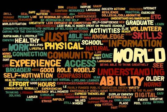
Wordle is a simple data visualisation tool which makes word clouds. A word cloud quickly allows people to see the major themes within a text which has been copied and pasted into http://www.wordle.net/ This provides an opportunity for a rich discussion about emerging themes.
In the Wordle below, we can get a quick impression of what P&C community members in one library meeting see as the needs of young people today. Click here to see detailed P&C survey responses which can be analysed for key messages and then presented as a digital story.
SCROLL RIGHT DOWN to see three other data visualisation tools.
Click here for Wordle instructions - this easy tool does not require sign up - and can also assist people with previewing main ideas in dense texts.
Create infographics to display your information visually
Online tools, such as Infogram, can show major themes and statistics, at a glance. Excel spreadsheet data can be imported and converted.
For example, the Infogram infographic below, Libraries as hubs, shows the community views of a P&C about 21st century libraries.
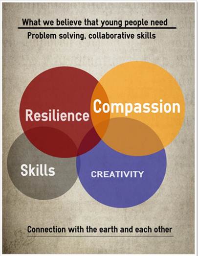
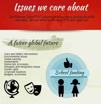
The three infographics below are impressionistic, rather than quantifiable. Their purpose is to synthesise key messages expressed by this P&C.
For example, the Infogram infographic below, Libraries as hubs, shows the community views of a P&C about 21st century libraries.
The three infographics below are impressionistic, rather than quantifiable. Their purpose is to synthesise key messages expressed by this P&C.
Piktochart infographics
Take a look at the Piktochart infographic below, which shows community concerns about current affairs issues.
Easelly infographics
Take a look at the Easelly infographic about what young people need.